

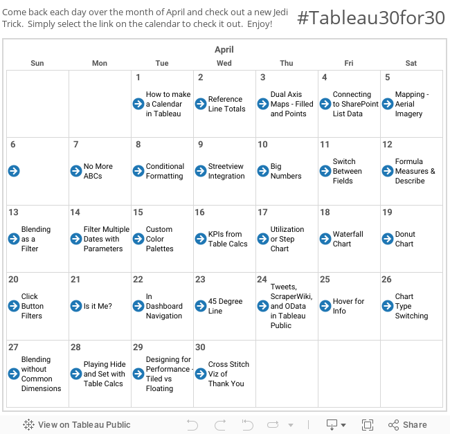
So when I was adapting the dashboard for our use I saw a trick in there from Mark that I had seen before but couldn't remember ever using - Is it Me? - and I've used it twice since then. It's what makes the chosen person to rise to the top of the scoring and what makes their name be highlighted in the ranking over time. Today we'll show you how to do both of those. Day 21!
So this should be another quick one. At it's essence, this trick takes a string parameter and checks to see what part of the data matches the parameter, and if it does then shows that data as different than everything else. Get it? Sorta? You'll see in a minute. This would work with almost any data set, so I'll of course be using Superstore (if it ain't broke don't fix it). Similar to yesterday we're going to create a few sheets and then use a parameter to change the data based on what/who is chosen. That's the "Is it Me?" part of the whole thing.
Here we go. I've gone ahead and created two sheets, I'm showing here below. Again the trick will work with almost anything, but you have to have something to start with:


Ok, now we're ready for the trick. We're going to create a parameter based on the Category field called "Category Is It Me?", it's a string parameter, and we're going to add in the values of the "Category" field by selecting "Add from Field">>Superstore>>Category, like this:

And you see this adds in all the values in from the Category field. A word of warning here - this is a snapshot list, ie if there are new Categories that get added into the data, they are NOT going to automatically get added to this list. The list is now a static set. It just so happens that the idea of Dynamic Parameters (parameters could update or be created from a function) is the #1 Idea for Tableau to implement from the Tableau Community. Enough of that. Now that we've created our parameter, we're going to create a simple calculated field (Super simple), called "Is it me?":

This is a boolean that is going to return True for the one Category that matches the chosen one from the parameter, and False for everything else. Here's an easy way to see what I mean - on the bar chart that we created before, add "Is it Me?" as the first thing on the Rows Shelf, and make it so that True is on top of False - it should look like this:

As you can see, because Appliances matches what we've chosen in the parameter, it's now sitting on top. Now all I need to do is right click on the "Is it Me?" pill and uncheck show header, and it disappears. I'll also bring "Is it Me?" to the color shelf and we end up with this:

Excellent. Now we're just going to do the same thing on the line chart and add "Is it Me?" to the Color Shelf, and we now get this:

I'll throw them both on a dashboard and add the parameter in there, and this is what you get:
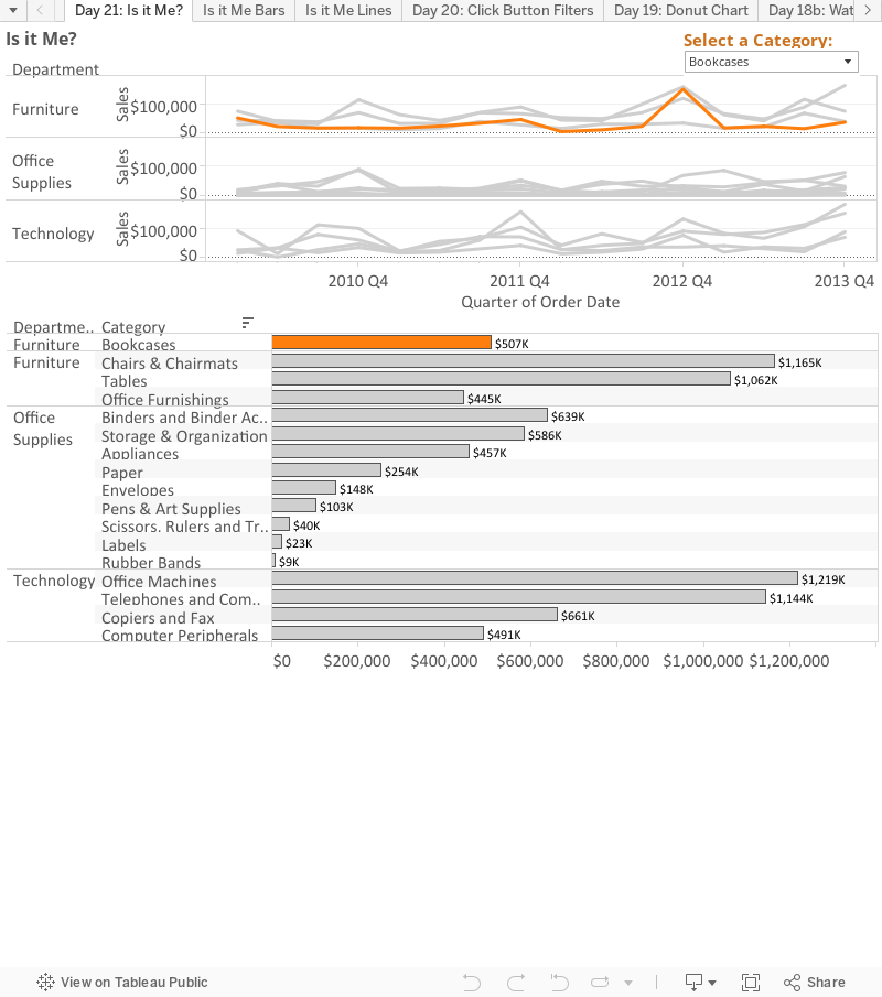
You see the color changes to highlight the category on the line chart and the top one changes on the bar chart. Pretty cool, huh? Tell Mark you're a fan...
That's it for today. See you tomorrow!
Nelson
nice blog , very helpful and visit us for VISUALIZATION SERVICES in UK
ReplyDeleteI read testimonies and reviews about him so I contacted him immediately, explained my problems to him. Same day , he casted a spell for me and assured me for 2 days that my husband will return to me and to my greatest surprise the third day my husband came knocking on my door and begged for forgiveness. I am so happy that my love is back again and not only that, we are about to get married again, he proposed. I wouldn't stop talking about him. Contact him today if you need his help via email: emutemple@gmail.com and you will see that your problem will be solved without any delay. Website: https://emutemple.wordpress.com/ whatsapp number +2347012841542
ReplyDelete